The Ultimate Guide to YouTube Thumbnail A/B Testing: How High-Contrast Expressions, Dynamic Lighting & Punchy Text Overlays Double Your CTR
Every single day, creators spend hours writing clever hooks, days editing footage down to the tightest frame, and weeks planning a killer concept. They render out a masterclass in video production, upload it to YouTube, drop a decent title in, and hit publish.
Then, they watch the analytics flatline.
If your click-through rate (CTR) is hovering somewhere around 2% or 3%, your videos are essentially bleeding out before anyone even gets a chance to see your hard work. The brutal reality of the platform is this: the algorithm can only push your video if people actually click it. And the gatekeeper to that click isn’t your hook or your editing—it’s your YouTube thumbnail.
If you want to pull yourself out of the sub-4% CTR graveyard, you have to master the art and science of thumbnail packaging. By combining high-contrast facial expressions, strategic mobile-friendly lighting, and bold typography overlays, you can completely transform how your channel performs. Let’s break down how to build an A/B testing workflow that actually moves the needle.
1. Why Thumbnail A/B Testing is the Secret Weapon of Top Creators
Most creators treat thumbnails like an afterthought. They grab a random frame from the video timeline, slap some generic text over it, and call it a day. Top-tier creators, on the other hand, treat thumbnails like ad copy. They know that a single visual tweak can mean the difference between 5,000 views and 500,000 views.
A/B testing takes the guesswork out of the process. Instead of guessing whether your audience responds better to a shocked face or a serious face, you let the data tell you.
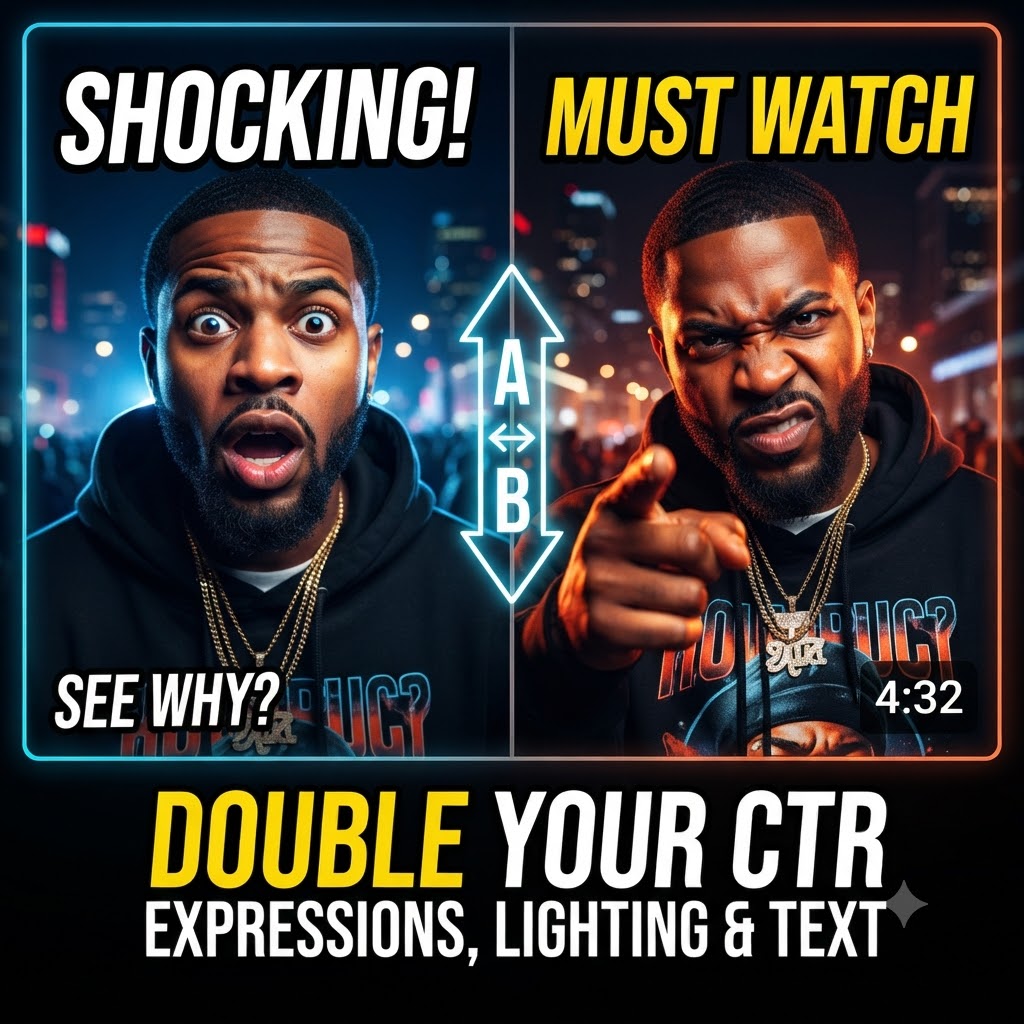
When you set up an A/B test on YouTube (or use extensions like TubeBuddy or VidIQ to track variations), you are pitting two distinct ideas against each other under identical conditions. You might test:
-
The Emotional Hook: Does a face showing pure disbelief outperform a face showing intense anger?
-
The Background Shift: Does a clean studio backdrop convert better than a chaotic, high-action street setting?
-
The Text Dilemma: Does adding a 3-word text overlay double your clicks, or does a text-free visual perform better for your specific audience?
By isolating these variables one by one, you stop throwing spaghetti at the wall and start building a repeatable, data-driven framework for growth.
2. The Psychology of High-Contrast Expressions
Let’s be honest: when people browse YouTube, they are usually doing it on a smartphone screen while commuting, lying in bed, or half-paying attention during a lunch break. They are doom-scrolling through a wall of flashing, brightly colored boxes.
If your thumbnail features a small, distant subject with a neutral expression, you are completely invisible.
The human brain is hardwired for survival cues, and those cues start with facial expressions. We instinctively scan crowds and feeds for emotion, intensity, and anomalies. To stop a thumb mid-scroll, your thumbnail needs to tap into this primal wiring.
-
Exaggerate, Don’t Fake: There’s a fine line between compelling expression and unwatchable cringe. You want your subject’s face to display an extreme, hyper-readable emotion—pure shock, absolute rage, ecstatic joy, or deep skepticism.
-
The Power of Direct Eye Contact: If your subject is looking directly down the barrel of the camera lens, it creates an immediate psychological lock with the viewer. It feels personal. It feels like you are staring right at them.
-
Separating Subject from Background: High contrast isn’t just about color; it’s about separation. If your artist or host is wearing a dark hoodie against a dark brick wall, they will blend into the background on a small phone screen. Use subtle rim lighting, masks, or color grading in post-production to make the face pop off the screen immediately.
3. Dynamic Lighting: Winning the Mobile Battle
You can have the most dramatic facial expression in the world, but if the lighting is flat, muddy, or underexposed, your thumbnail will turn into an unreadable pixelated mess on mobile devices.
Lighting for YouTube thumbnails is entirely different from lighting for cinematic video. Cinematic video relies on moody shadows and low-key contrast. Thumbnail design relies on instant clarity.
-
Embrace Over-Exposure (Within Reason): Don’t be afraid to bump up your global brightness and contrast higher than feels “natural.” When a thumbnail is scaled down to the size of a postage stamp in a mobile feed, details get crushed. Bright, clean lighting cuts through the clutter.
-
Master the Color Wheel: Utilize complementary color contrast. If your background leans heavily into cool tones (blues, cyans, deep purples), make your subject stand out with warm tones (oranges, yellows, bright reds). This visual contrast forces the eye to focus right where you want it.
-
Directional Key Lighting: Flat, front-facing ring light setups can sometimes make a face look washed out and lifeless. Instead, use a strong side-light or a dramatic key light to cast subtle shadows that emphasize facial structure, adding depth and a high-budget feel to the shot.
4. Typography Overlays: Less is Always More
One of the biggest mistakes creators make with thumbnail text is trying to tell the entire story of the video right there on the image. They write out a long sentence, shrink the font down to fit, and wonder why nobody can read it.
Remember: the viewer can already read your video title. Your thumbnail text shouldn’t repeat the title; it should complement it, build curiosity, or act as an emotional multiplier.
-
The 4-Word Rule: Keep your text to three or four words maximum. If it takes a viewer more than half a second to process the words, you’ve lost them. Use punchy, high-impact phrasing like “THIS HAPPENED,” “BIG MISTAKE,” or “FINALLY.”
-
Choosing the Right Font: Ditch fancy script fonts or thin serif fonts. Stick to thick, heavy, sans-serif typefaces like Montserrat, Bebas Neue, or Impact. They remain legible even when viewed on a tiny screen from three feet away.
-
Watch Out for the Timestamp: Never place critical text or important visual elements in the bottom-right corner of your thumbnail. YouTube places the video duration badge right there, which will awkwardly slice right through your message and ruin the composition.
5. Turning Clicks Into Real Momentum
When you finally nail this trifecta—high-contrast expressions, punchy mobile-optimized lighting, and ultra-short typography—you’ll notice an immediate shift. Your CTR ticks up from 3% to 6%, then to 8%. Suddenly, YouTube’s algorithm realizes people actually want to watch what you’ve put together, and your impressions multiply.
Of course, a high-click thumbnail converts impressions into view velocity when paired with our hip-hop music video promotion packages. Once the visual packaging gets them through the door, the real momentum begins.
Keep testing, keep refining your visual hooks, and don’t settle for average packaging. Your content deserves better than a low CTR.