Spotify Canvas vs. Apple Music Motion Art: Formatting Visuals for Max Streams
Let’s be real: in today’s music landscape, audio quality is just the price of admission. Fans are scrolling fast, attention spans are fried, and nobody just listens to music anymore—they consume it as a total vibe.
That’s where visual loops come in. Spotify Canvas and Apple Music Motion Art aren’t just aesthetic bells and whistles anymore; they are core tools for keeping people locked onto your track. When done right, they hook listeners instantly, drive track shares, and keep eyes glued to the “Now Playing” screen.
The catch? Formatting visual loops for these two platforms takes completely different playbooks. Here is how visual motion impacts retention on both apps, and how to format 9:16 loops that complement your mix instead of fighting it.
The Strategic Divide: Spotify vs. Apple Music
Before messing with aspect ratios and file sizes, it helps to understand how people actually interact with visuals on each platform.
-
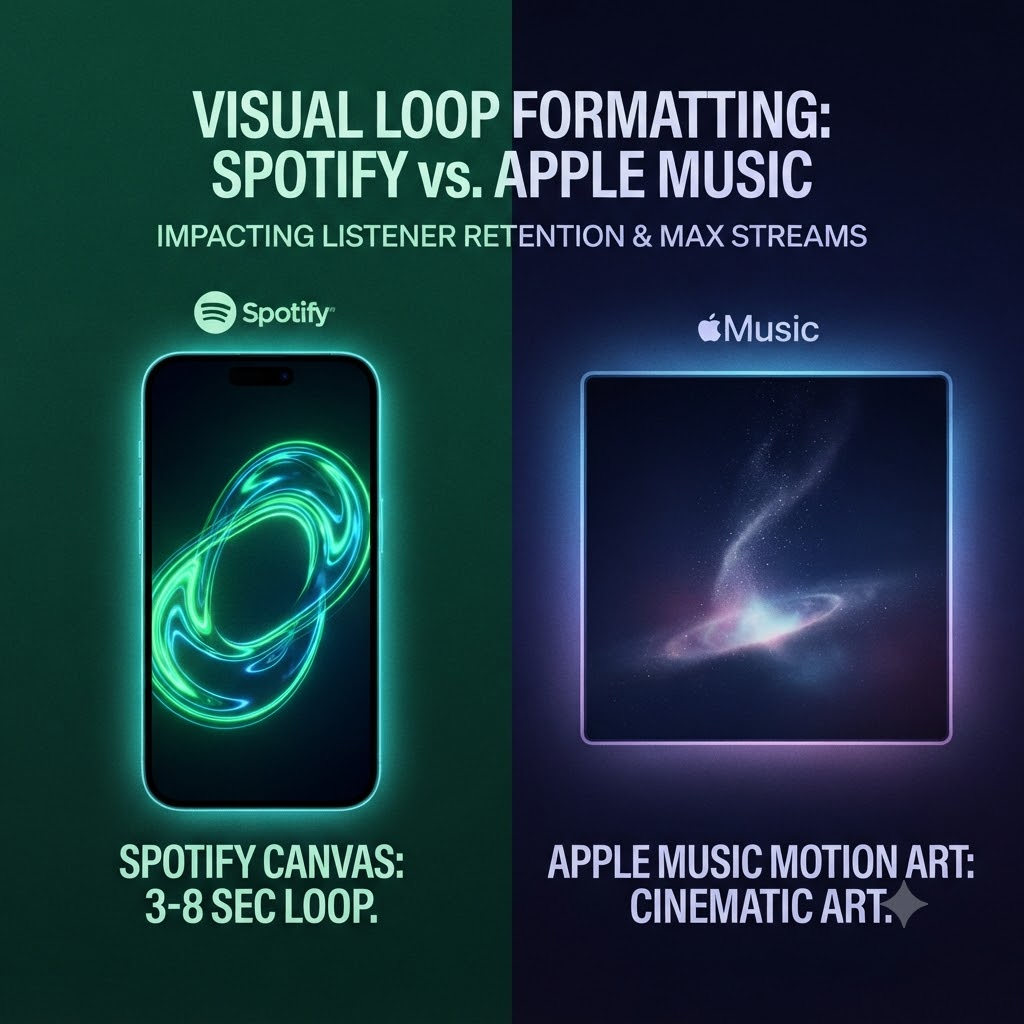
Spotify Canvas (The Micro-Hook): These are those 3-to-8-second vertical loops playing behind your mobile track info. They’re fast, hypnotic, and built for rapid-fire scrolling. Tracks with a Canvas consistently see higher shares and playlist adds because that little bit of motion gives fans a reason to stay on your page.
-
Apple Music Motion Art (The Cinematic Experience): Apple plays a different game. They use longer loops (ranging anywhere from 8 to 35 seconds) that turn your actual album cover into a living piece of art. Apple listeners tend to be deep-album explorers checking out tracks on iPads, Macs, or full-screen iPhone views. It’s all about high-end curation and immersion.
Formatting for Success: Specs That Don’t Distract
The biggest rookie mistake is treating a Canvas or Motion Art piece like a mini music video. Moving artwork shouldn’t distract from your music—it should pulse in rhythm with the mood of the track.
1. Spotify Canvas: The Art of the Micro-Loop
Because a Spotify Canvas is only a few seconds long, any clunky jump-cut or blinding flash will make viewers swipe away fast.
-
Dimensions: Vertical 9:16 ratio (1080 × 1920 pixels).
-
The Loop Rule: Go for a seamless loop, a smooth ping-pong effect (forward then reverse), or a hard cut that feels entirely intentional. Avoid jarring cuts that break the trance.
-
The Safe Zone: Spotify slaps track titles, progress bars, and follow buttons right over the video. Keep your main subject dead center and leave a little breathing room around the edges.
-
Skip the Text: Your song title and artist name are already sitting right underneath the player. Don’t crowd the screen by pasting text onto your video.
2. Apple Music Motion Art: Cinematic Elegance
Apple’s guidelines are notoriously strict. They require exact matching aspect ratios (typically a 1:1 square for desktop/tablet and a 3:4 tall format for mobile).
-
First Frame Accuracy: Your animation must start on the exact frame of your static album cover. No abrupt surprises when the track loads.
-
No Strobing: Apple will instantly reject rapid cuts, heavy strobing, or tacky marketing text/social handles. The animation needs to feel organic—think subtle smoke drifting, neon lights flickering slowly, or gentle water ripples.
-
Mind the UI: On the iPhone’s 3:4 layout, make sure your core visuals aren’t hidden behind the player gradients at the bottom.
Bridging the Gap Between Visuals and Streams
Great visual art looks amazing, but it won’t drive numbers in a vacuum. Once your loops are live on both platforms, the immediate goal is driving targeted traffic directly to your profile so people actually experience that polished setup.
…once your motion artwork is uploaded, drive instant eye-level traffic to your profile through our channels.
Pairing clean, non-intrusive visuals with real visibility creates a snowball effect: listeners hang around longer because the aesthetic is on point, the algorithm notices the high retention, and your track gets pushed out to a wider crowd.