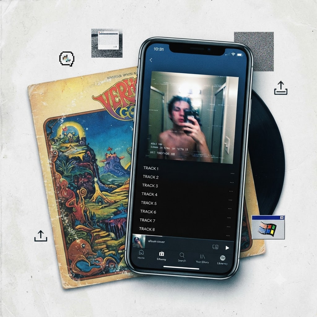
Remember spending hours flipping through a physical vinyl gatefold or reading the liner notes of a CD booklet? For a long time, album art was a massive part of how we connected with an artist’s world.
Fast forward to today, and open up Spotify or Apple Music. Instead of a polished digital painting, you are just as likely to see a blurry iPhone screenshot taken in a bathroom mirror, a raw Windows 95 error message, or a stark, low-res graphic.
This pivot from traditional design to DIY minimalism isn’t just a lazy shortcut. It’s a massive cultural shift in how music is marketed and consumed. Here is a look at why traditional album cover art lost its stronghold and why raw smartphone aesthetics took over.
1. The Screen Size Reality: Designing for the Thumbnail
The biggest driver behind this change is physical reality. When music moved from 12-inch vinyl records and CD cases down to a tiny thumbnail on a smartphone screen, the rules of visual design totally changed.
-
The Thumbnail Test: Intricate paintings, subtle symbolism, and tiny typography completely disappear when you shrink them down to a mobile playlist icon.
-
The Scroll Factor: Artists and labels realized that bold, high-contrast, or jarringly plain images grab attention much faster in a crowded feed than a complex piece of digital art.
-
Shifting Budgets: Without physical packaging to hold and display, the financial push to commission expensive, multi-layered artwork just isn’t the priority it used to be.
2. The Power of “Anti-Design” and Raw Authenticity
We live in an era of heavy social media filters and AI-generated polish, which means perfection can often start to feel sterile. Modern listeners want real, human connection, and traditional corporate design doesn’t always cut it.
-
The iPhone Screenshot Vibe: Using a casual snapshot sends a clear message: I am just like you, I made this on my phone, and the music speaks for itself. It strips away the industry smoke and mirrors.
-
Nostalgic Minimalism: Grainy pixel art, harsh typography, and early-internet aesthetics tap into a collective craving for a simpler, pre-algorithm digital past.
-
Rejecting Major Label Gloss: Keeping things minimal is often an aesthetic choice. Indie and underground artists use raw visuals to signal that they aren’t bound by traditional industry playbooks.
3. Speed, Cost, and the Modern Release Cycle
The music industry moves fast. Between frequent single drops, rapid-fire playlists, and the constant demand for content, artists have to keep the momentum going.
-
Agility Beats Waiting: Waiting months for a concept artist to deliver a masterpiece just doesn’t fit the modern release schedule.
-
Total DIY Control: Musicians don’t need a massive art department budget anymore. With an iPhone and a photo-editing app, an artist can dream up, shoot, and finalize their cover art in minutes.
Where Music Visuals Are Headed
While high-concept physical art is still alive and well for major pop and rock rollouts, the definition of what makes “good” cover art has permanently changed.
The move toward raw iPhone shots and minimalist graphics proves that in today’s digital landscape, immediacy and realness often beat out technical perfection.
What’s your take on this? Do you miss the days of detailed album artwork, or are you all-in on the modern lo-fi aesthetic? Let’s talk about it in the comments.